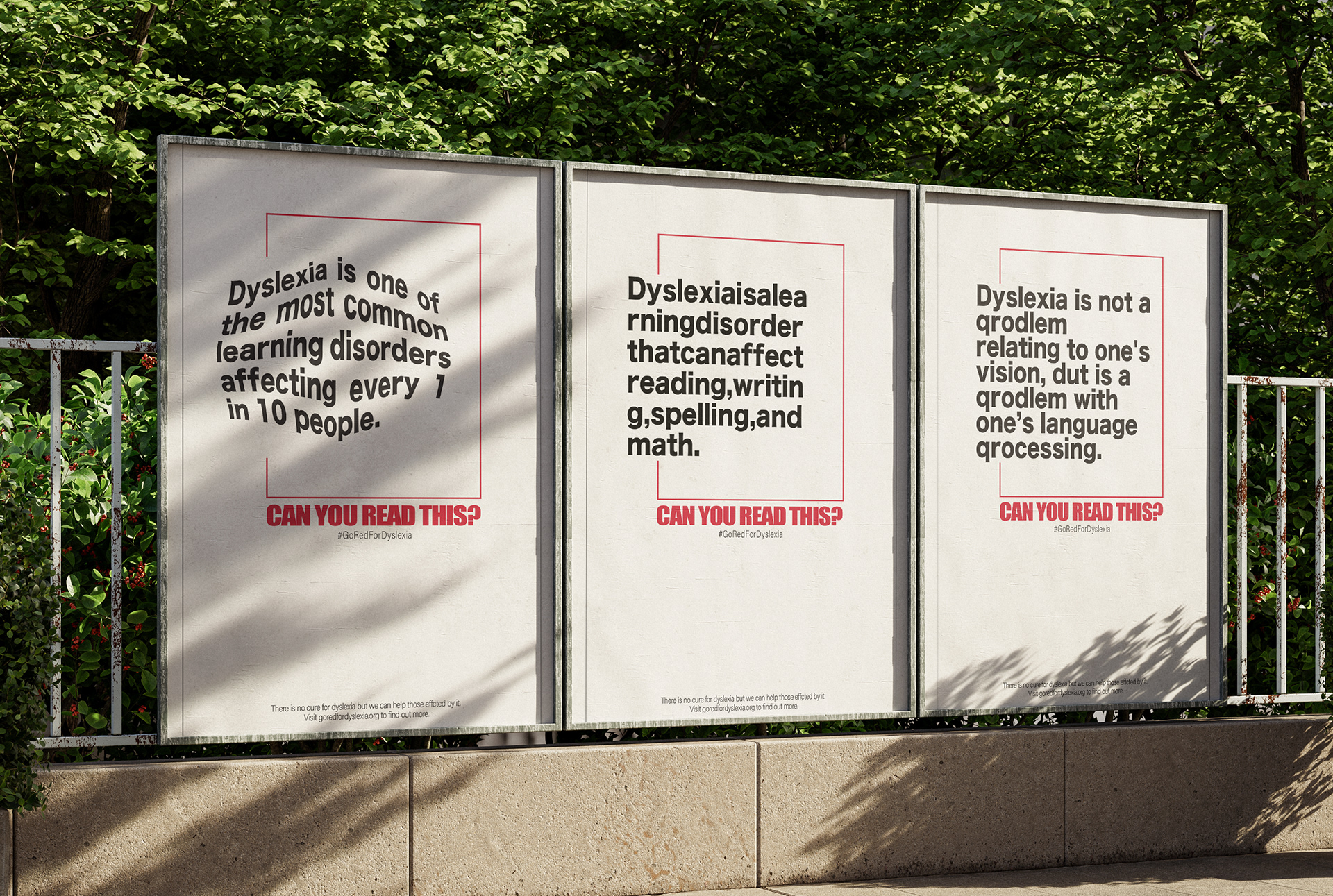
Dyslexia is something I have been personally living with all my life. I wanted, through the use of typography, to visually show what it's like for someone who has dyslexia. So I chose 3 different forms of how people with dyslexia read and altered the typeface to mimic it. I took heavy inspiration from Go Red for Dyslexia which is a nationwide movement to spread awareness for dyslexia. That's where I got the idea for the red box from. I wanted to heavily emphasize the text, so I chose to do a very simple design.